Learn effective thumbnail A/B testing to boost your click-through rate.
In the hyper-competitive world of YouTube, your video's success is decided in a fraction of a second. This is the moment a potential viewer scrolls past your content and makes a snap judgment: click or skip. This decision hinges almost entirely on your thumbnail. It is not just an image; it is the single most important marketing asset for your video, acting as a crucial bridge between your video title and the content itself. A difference of just 1-2% in your click-through rate (CTR) can mean the difference between 10,000 views and 100,000 views.
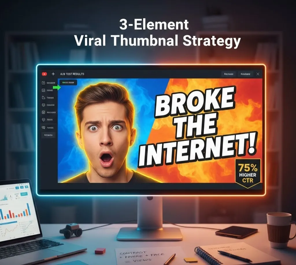
For years, top creators—from MrBeast to high-end educational channels—have been perfecting a specific, data-driven approach. We call this the 3-Element Viral Thumbnail Strategy. This strategic formula strips down the thumbnail to its most effective, attention-grabbing, and psychological components, guaranteeing a higher chance of virality.
This guide will break down the three essential elements, explain the psychology behind their effectiveness, and provide a masterclass in modern thumbnail A/B testing to ensure you never have to guess what works again.
Element 1: High-Contrast Background (The Attention Grabber)
The first, and arguably most foundational, element is the background. Its primary job is simple: to make your thumbnail pop against the YouTube feed, which is often a neutral mix of white, grey, or dark-mode black. You must create visual separation from the surrounding content—a strategy rooted in the basic psychology of human perception.
The Science of Contrast
The human eye is instantly drawn to high contrast. This doesn't just mean light vs. dark; it means leveraging complementary colors. Complementary colors are those directly opposite each other on the color wheel, creating the maximum amount of visual friction and intensity.
| Primary Color | Complementary Contrast Color | Psychological Effect |
|---|---|---|
| Blue | Orange (or Yellow) | Trust, tech, and energy. Highly effective for tutorials and reviews. |
| Red | Green (Cautionary) | Urgency, excitement. Green can be used for "growth" or "money" themes. |
| Purple | Yellow | Creativity, luxury, and high-energy appeal. |
High-contrast background best practices involve a limited color palette—typically only two or three core colors. If your main subject (Element 2) is dark, your background should be brightly lit or a neon color. If your subject is brightly lit (which is often the case), a dark, blurred, or color-blocked background will push the subject forward, creating the essential depth needed for mobile viewability.
The Clarity Principle
Your background should support, not compete with, your main subject. A common mistake is using a busy, high-detail background (like an un-blurred screenshot of gameplay or a busy stock photo). This slows down the viewer’s cognitive processing. By blurring, desaturating, or using a solid, complementary color for the background, you decrease the processing time and allow the viewer’s focus to snap instantly to Element 2.
Element 2: One Expressive Face or Icon (The Emotional Hook)
Once you've grabbed the viewer’s attention with contrast, the second element is designed to secure their emotional investment. This is where you introduce the human element of expressive faces or a highly recognizable, central icon.
The Face Advantage
Decades of evolutionary psychology have hardwired the human brain to prioritize faces. They signal emotion, intent, and connection. A face in a thumbnail, especially one showing an exaggerated, authentic emotion, immediately tells a micro-story about the video's content.
- The Emotion is Key: A slight smile is often ignored. A face showing genuine surprise, shock, confusion, or ecstatic joy is a viral magnet. The emotion displayed should directly correspond to the viewer’s feeling before or after watching the video. For instance, a finance video about a shocking market crash should feature an "oh no!" shocked face.
- Size and Placement: The expressive face should be large—often taking up 30% to 50% of the thumbnail—and positioned strategically to avoid being covered by the video duration timestamp or the channel badge. Using a clean cutout (a photo with the background digitally removed) of the face and applying an outer glow or a strong drop shadow further enhances its separation from the background.
- The Eye-Line Hook: When possible, the subject should appear to be looking directly at the camera. This eye contact creates a powerful, personal connection, as if the creator is sharing a secret or reacting with the viewer.
When to Use an Icon
If your channel doesn't feature a person (e.g., historical channels, pure tutorial screencasts, abstract concepts), Element 2 becomes a highly-focused icon or object. This object must be immediately recognizable and represent the video’s core topic.
- Examples: A bright, oversized Bitcoin symbol for a crypto video; a glowing, singular red button for a software tutorial; a high-definition image of a historical artifact.
- Focus: Just like the face, this icon must be the single, undisputed focal point. Use lighting, outlines, or arrows to ensure no other visual element competes with it.
Element 3: 3-5 Bold Power Words (The Curiosity Gap)
The final element is the text overlay. It must deliver the final piece of the puzzle—the hook that sparks curiosity—using minimal text. This text works in tandem with the title to form a compelling narrative.
The Power of Minimalism
The rule of thumb for viral thumbnails is less is more. Viewers are scanning; they are not reading. The eye has to process and understand the text in under one second.
- 3-5 Bold Power Words: Limit your text to a concise, bold phrase of 3-5 words, max. These should be "power words" that convey urgency, massive benefit, or shocking results. Examples: "I QUIT My JOB!," "$10,000 In 24 HOURS," or "The TRUTH About AI."
- Readability is King: The font must be large, bold, and a clear, sans-serif style (like Impact, Anton, or Bebas Neue). Crucially, the text must have a high CTR-inducing contrast against the element it is placed over. If it's over the background, it should contrast with the background. If it's over the subject (which should generally be avoided), it needs an extreme outline or stroke to separate it.
- Strategic Number Use: Numbers are a form of universal language that immediately quantify the value proposition. Using numbers like $100, 10X, or 5 SECRETS makes the text more scannable and promises a concrete takeaway.
The Full Formula in Action:
When all three elements combine, you get the viral equation:
High-Contrast Background Expressive Face 3-5 Bold Power Words = High CTR
A bright yellow or neon background pushes forward a large, shocked-face cutout, which sits next to the bold, white text that says "IT BROKE THE GAME."
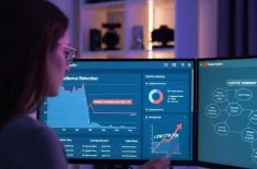
Mastering the Data: Effective Thumbnail A/B Testing
Design is an art, but performance is a science. The only way to truly guarantee a High CTR is through rigorous thumbnail A/B testing. A/B testing, also known as split testing, involves showing different thumbnail variations (A and B) to different, equally sized segments of your audience to see which one performs better.
The Scientific Method of Testing
Effective A/B testing adheres to a strict scientific rule: Test one variable at a time.
- Define Your Goal: Your primary metric should be the click-through rate (CTR). This is the percentage of viewers who click your video after seeing its thumbnail and title combination.
- Create Two Variants (A & B):
- Variant A (Control): Your initial, well-designed thumbnail.
- Variant B (Test): A version that changes only one element from Variant A.
- Variable Examples to Test:
- Background Color: A red background vs. a blue background.
- Facial Expression: A shocked face vs. a confused face.
- Text Content: "I Used AI for a Week" vs. "AI Generated My Life" (keeping font, size, and color the same).
- Focal Point: A person vs. a close-up object/icon.
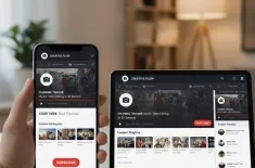
- Execute the Test: YouTube’s native Test & Compare feature (or third-party tools like TubeBuddy/vidIQ) is the ideal way to run this. It automatically splits your audience impressions.
- Set the Timeframe: Run the test for a minimum of 3-7 days. This allows for a large enough sample size and accounts for audience fluctuations. Aim for at least a few thousand impressions per variant.
- Analyze and Repeat: Once the test concludes, the winner will have a statistically significant higher CTR. Apply the winning thumbnail to the video permanently. The next time you create a video, use the winning element as the new control and test another single variable. This continuous process is how you fine-tune your channel's unique, high-performing thumbnail style.
Key takeaway for A/B testing: The thumbnail that wins isn't the one you personally like best, but the one that the data confirms generates the highest click-through rate.