Discover safe zone placement tips to keep your call-to-action text visible and clear.
Mastering the Art of the Text Overlay: Using On-Screen Elements as Strategic Sales Tags
In the high-speed world of social commerce and short-form video, you have approximately 1.5 seconds to stop a user from scrolling. While high-quality video production is the foundation, the "secret sauce" of conversion often lies in what you layer on top.
Using a text overlay as a digital pricing tag or a directional signpost is no longer just a trend—it is a fundamental requirement for social selling. Whether you are on TikTok, Instagram Reels, or YouTube Shorts, your message needs to be heard even when the sound is off.
The Strategic Power of On-Screen Text
On-screen text serves as the "silent salesperson." It bridges the gap between entertainment and e-commerce by providing context that visuals alone might miss. When you use text as a sales tag, you aren't just adding captions; you are creating a visual hierarchy that guides the viewer's eyes toward a purchase.
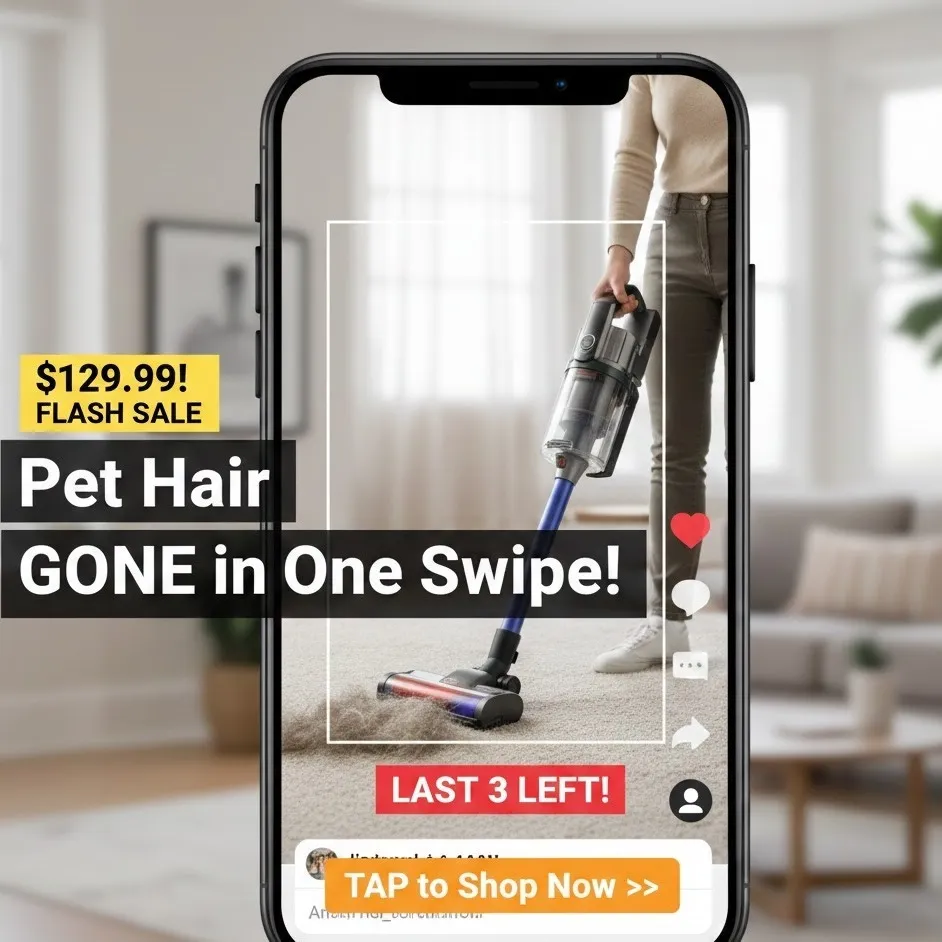
1. Establishing Value with the Pricing Tag
In a traditional store, you wouldn’t dream of displaying a product without a price. In the digital space, a well-placed pricing tag overlay eliminates friction. It qualifies the lead immediately. If a viewer knows a product is $19.99 versus $199.00, they can make an instant mental decision to engage further.
2. Highlighting the Key Benefit
Your video might show a vacuum cleaner working, but the key benefit text—such as "Pet Hair Gone in One Swipe"—solidifies the "why" behind the purchase. Text overlays allow you to shout your unique selling proposition (USP) without needing a voiceover to compete with background music.
3. Creating a Sense of Urgency
The "Buy Now" impulse is fragile. By adding urgency through overlays like "Flash Sale: Ends in 2 Hours" or "Only 5 Left in Stock," you trigger the Fear Of Missing Out (FOMO). This psychological nudge is often the difference between a "Like" and a "Sale."
Best Practices for Strategic Placement
The biggest mistake creators make is placing vital information where the app's interface (UI) covers it. If your call-to-action text is hidden behind a "Like" button or a username, it might as well not exist.
Navigating the "Safe Zones"
Every platform has a "Dead Zone"—areas where the caption, profile icon, and engagement buttons live.
- The Center-Third Rule: Keep your most important on-screen text in the middle 60% of the screen.
- Avoid the Bottom Fifth: This is where the video description and music attribution sit.
- Avoid the Right Edge: This is the "engagement column" (Like, Comment, Share).
Visibility and Aesthetics
Contrast is King: Use high-contrast colors (e.g., white text with a black background box) to ensure readability regardless of the video background.
Mobile-Friendly Design: Remember that most users view content on vertical screens. Ensure your text is large enough to read on a small device but not so large that it obscures the product. Making your content mobile-friendly means testing how it looks on various screen ratios.
Crafting High-Conversion Call-to-Action (CTA) Text
A call-to-action text overlay should be directive and specific. Vague phrases like "Check it out" are less effective than "Click the Orange Cart" or "Tap the Link in Bio."
| Strategy | Example Text | Psychological Trigger |
|---|---|---|
| Direct Instruction | "Click the Orange Cart" | Clarity & Guidance |
| Scarcity | "Limited Stock Available!" | Urgency |
| Value-First | "Save 50% Today Only" | Incentive |
| Social Proof | "Join 10,000 Happy Customers" | Trust |
Optimizing for Different Content Formats
Short-Form Video (TikTok/Reels/Shorts)
In these formats, the on-screen text should be dynamic. Don't let a sales tag sit statically for 60 seconds. Pop the pricing tag in when the product is first shown, and flash the urgency message toward the end.
Live Streaming
During a live shopping event, text overlays act as a persistent billboard. Use them to rotate through different key benefits as new viewers join the stream at different times.
The Technical Checkpoint: Ensuring Readability
Before you export your video, run through this checklist to ensure your mobile-friendly overlays are optimized:
- Font Selection: Use sans-serif fonts (like Roboto or Montserrat) for better digital legibility.
- Duration: Does the text stay on screen long enough for a slow reader to finish it?
- Animation: Use subtle entrance animations (fade-in or slide) to draw the eye without being distracting.
- Placement Testing: Use a transparent "Safe Zone" overlay in your editing software to verify that no text is cut off by the UI.
Summary: The Formula for Sales Tag Success
Effective text overlays are a blend of psychology and design. By highlighting a key benefit, displaying a clear pricing tag, and injecting urgency, you transform a standard video into a high-converting sales machine. Always prioritize the user experience by keeping the design mobile-friendly and ensuring your call-to-action text is visible and easy to follow.