Learn how high contrast text, like yellow on black, uses psychological science to boost engagement and clarity in videos designed for no sound viewing.
The Science of Color and Text Overlay: Maximizing Engagement in a Silent Video World
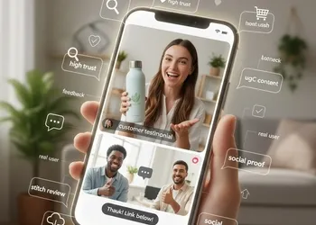
In the modern digital landscape, the way we consume information has fundamentally shifted. With the rise of "auto-play" features on social media platforms like Instagram, TikTok, and LinkedIn, a staggering 80% of videos are watched on mute. This shift has elevated the role of graphic design from mere aesthetics to a critical component of communication strategy.
Understanding the science behind color and text overlay is no longer just for graphic designers; it is a vital skill for content creators, marketers, and educators who need to ensure their message lands, even in a no sound viewing environment.
The Psychology of High Contrast: Why It Matters
When a viewer scrolls through a feed, you have less than three seconds to capture their attention. This is where the biological response to contrast comes into play. Our brains are hardwired to notice differences in light and color—a survival instinct that once helped us spot predators in the wild and now helps us spot headlines on a screen.
The Power of White on Black
The combination of white on black is the gold standard for modern digital interfaces, often referred to as "Dark Mode." Psychologically, white text on a dark background reduces ocular strain in low-light environments and creates a sense of sophistication and authority. It provides a clean, crisp canvas that allows the text to "pop" without overwhelming the viewer's retina.
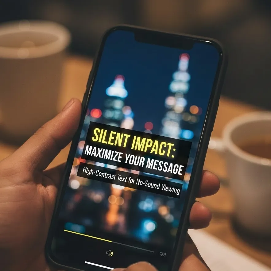
The Urgency of Yellow on Black
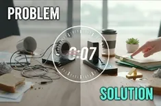
If white on black is about clarity, yellow on black is about attention and urgency. Scientifically, yellow is the most visible color of the spectrum and the first color the human eye notices. When paired with a black overlay, it creates the highest level of luminance contrast possible. This is why caution signs and taxi cabs use this scheme. In a text overlay, it signals to the brain that the information is high-priority or a "must-read" takeaway.
Visual Hierarchy: Guiding the Viewer’s Eye
Even with the right colors, a cluttered screen will lead to "cognitive overload," causing the viewer to scroll past. visual hierarchy is the arrangement of elements in a way that implies importance. To master visual hierarchy in silent video:
- Size Matters: The "hook" should be the largest element.
- Positioning: Place crucial text in the center or top-third of the frame.
- Weight: Use bold fonts for high contrast text to ensure the characters don't "bleed" into the background color.
Accessibility and the "Silent Viewer"
Designing for no sound viewing isn't just a trend; it's an accessibility requirement. People with hearing impairments, as well as those in public spaces without headphones, rely entirely on your text overlays to understand the context.
The Contrast Ratio
To meet Web Content Accessibility Guidelines (WCAG), text should have a contrast ratio of at least 4.5:1. For high contrast text, aiming for 7:1 ensures that users with visual impairments or those viewing screens in bright sunlight can still digest your content.
Best Practices for Text Overlays
To ensure your key message is clear, follow these scientific principles of legibility:
| Element | Recommendation | Why it works |
|---|---|---|
| Color Pairings | Yellow on black or white on black | Maximum luminance contrast. |
| Font Choice | Sans-serif (e.g., Helvetica, Montserrat) | Cleaner lines are easier to read on low-resolution mobile screens. |
| Duration | 1 second per 3-4 words | Gives the brain enough time to process the "shape" of the words. |
| Background | Semi-transparent black boxes | Separates text from busy video backgrounds to maintain contrast. |
Psychological Impact: The "Cognitive Load" Theory
The "Cognitive Load Theory" suggests that our working memory has a limited capacity. When a user is watching a video, they are processing moving images, possibly music, and text simultaneously. If the text overlay is difficult to read, the brain spends too much energy trying to decode the letters and not enough energy absorbing the message.
By using high contrast text, you remove the "friction" of reading. The message is delivered effortlessly, leading to higher retention rates and better brand recall.
Conclusion: Designing for the Mute Button
The "silent revolution" in digital media has turned every video creator into a typographer. By leveraging the psychological impact of white on black for clarity and yellow on black for emphasis, you ensure your content is inclusive, professional, and effective. Remember, in a world of no sound viewing, your text doesn't just support the story—it is the story.