Master mobile optimization for TikTok sales.
Optimizing Your Product Page for TikTok: Converting Mobile Users Instantly
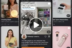
The landscape of e-commerce is constantly evolving, and perhaps no platform is driving change quite like TikTok. With its hyper-visual, fast-paced format, TikTok has become a powerhouse for product discovery and viral trends. But driving traffic from a 15-second viral clip to your product page is only half the battle. The real challenge is ensuring that product page converts the impulse-driven mobile optimization user who clicks through.
A product page designed for TikTok traffic must be radically different from one optimized for desktop search. It needs to be a lean, mean, converting machine, focusing on speed, visual punch, and instant gratification. This comprehensive guide will walk you through the essential steps and best practices for creating a product page that not only handles the massive surge of TikTok traffic but turns those fleeting views into solid sales.
The TikTok Shopper: Understanding the Mindset
Before diving into the mechanics, understand the intent. The TikTok shopper is not performing a long research process. They are:
- Impulsive: They saw a compelling need, solution, or trend and clicked immediately.
- Time-Sensitive: They expect the page to load instantly and deliver key information in seconds.
- Visually Driven: They are coming from a high-quality video; static text alone won't hold their attention.
- Mobile-First (and Only): Their entire journey, from discovery to purchase, is happening on a small screen.
This mindset necessitates a design philosophy centered around clarity, speed, and trust, all delivered instantly.
The Foundation: Mobile Optimization is Non-Negotiable
If your page isn't perfectly structured for a phone screen, you are losing sales before the user even sees your product. Mobile optimization is the single most critical factor for TikTok traffic.
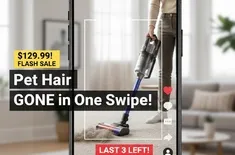
- Lightning-Fast Load Speed: Use tools like Google PageSpeed Insights. Aim for a loading time of under 2 seconds. Compress all images and leverage modern caching techniques. TikTok users will abandon a slow-loading page in milliseconds.
- Thumb-Friendly Design: All buttons, especially "Add to Cart," must be large and easily tappable with a thumb, typically at the bottom of the screen (sticky CTA bars work wonders here).
- Single-Column Layout: Eliminate complex grid layouts that require horizontal scrolling. A clean, stacked, single-column design keeps the user focused on scrolling down to the purchase action.
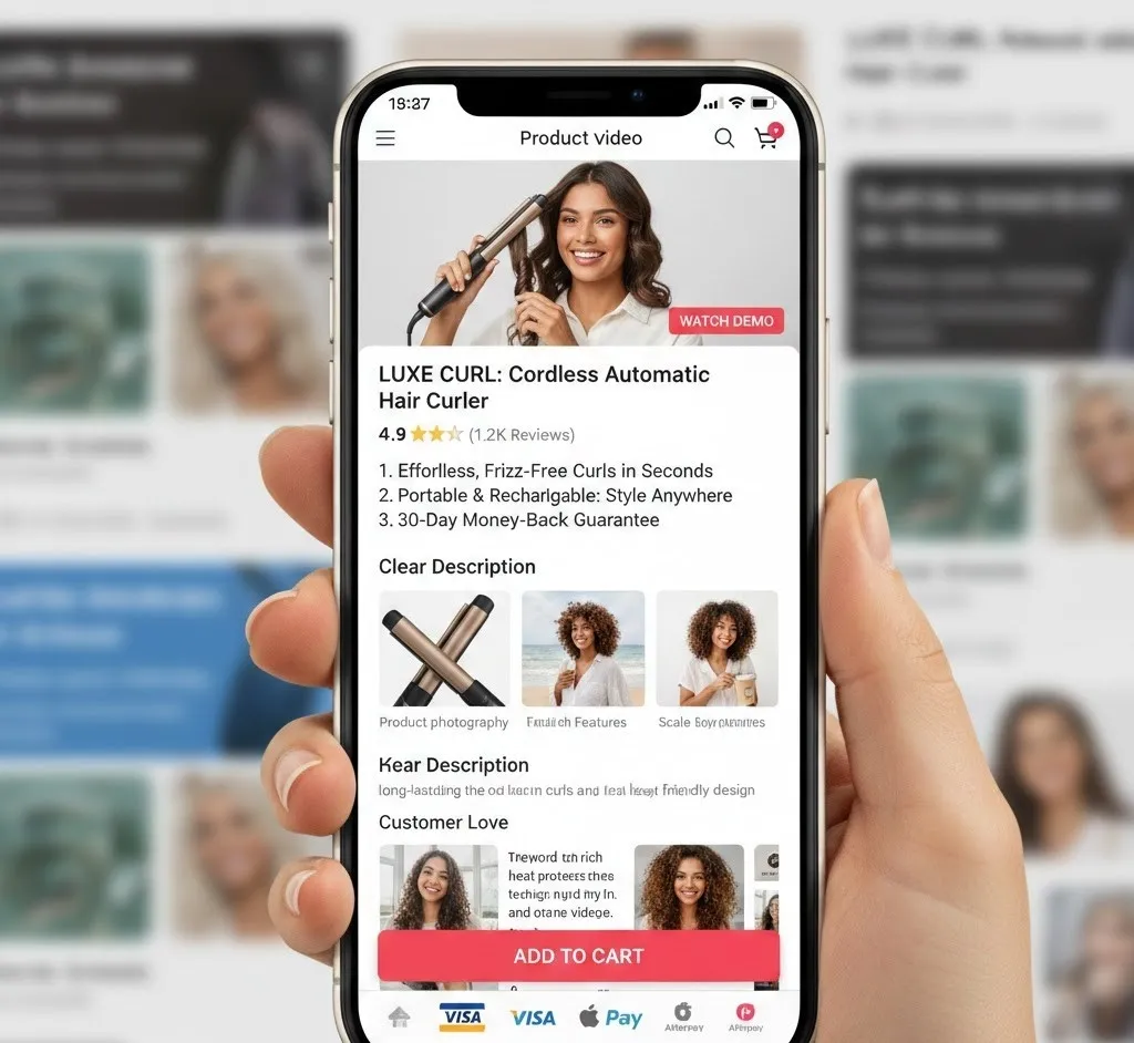
- Above-the-Fold Priority: The top of the page must feature the product name, price, main image/video, and the "Add to Cart" button. Everything else is secondary and goes below the fold.
The Visual Powerhouse: Product Photography and Video
The user has just seen a captivating video on TikTok. Your product page visuals must match or exceed that quality. This is where you replace the hook with the proof.
1. High-Quality, Short Product Videos (The New Standard)
A product video is no longer a "nice-to-have"; it's the mandatory hero asset for TikTok traffic.
- Position: Place the video as the main media asset, before static images.
- Duration & Style: Keep it short (10-20 seconds maximum). It should mirror the style of the viral TikTok video but be slightly more informational. Focus on:
- In-use demonstration: Show the product solving the problem it was introduced for.
- Scale/Size: Clearly show the product in a person's hand or next to a common object.
- Key Benefit Focus: Re-state the primary benefit shown in the ad.
- Auto-Play (Muted): Configure the video to auto-play upon page load (muted) to immediately grab the user's attention.
2. Optimized Product Photography
While the video is primary, your product photography must back it up and address key user questions.
- Variety is Key: Showcase 5-8 images that cover all angles. Include:
- Clean, white-background shots (for product clarity).
- Lifestyle shots (showing the product in a relevant setting).
- Detail shots (close-ups on unique features or material quality).
- Scale shots (as mentioned, to prevent purchase friction).
- Mobile Cropping: Ensure that the most critical part of the image is visible even when the image is cropped slightly on different mobile screens. Avoid putting vital info near the edges.
The Textual Punch: Clarity and Benefit-Driven Content
The textual content needs to be scannable, persuasive, and instantly understandable. The goal is to articulate the benefit quickly, not to write a novel.
The Power of Bullet Points
For the TikTok shopper, long paragraphs are a death sentence. Your clear description must start with bullet points—3 to 5 benefit-driven points placed directly under the video/images and above the long description.
- Focus on 'Why,' Not 'What': Instead of "Made of durable steel," write "Built to last a lifetime, saving you money on replacements."
- Quantify the Benefit: Use numbers where possible. "Get ready in 5 minutes" is better than "Saves time."
- Address Objections: Use one bullet point to preemptively address a common concern (e.g., "Non-slip grip ensures total safety").
Trust Signals and Purchase Friction
Trust is built differently for the TikTok shopper. They don't have time to browse your "About Us" page. Trust must be integrated into the product page itself.
- Social Proof Above the Fold: Display a clear average star rating (e.g., 4.9 Stars based on 1,200 Reviews) immediately below the product title.
- Clear Policies: Briefly mention your risk-free promises near the "Add to Cart" button, such as: "30-Day Money-Back Guarantee" or "Free Shipping on Orders Over $50."
- User-Generated Content (UGC): Integrate authentic reviews and customer photos/videos lower on the page. UGC is the native currency of TikTok and significantly boosts conversion rates.
- Payment Options: Clearly show recognizable payment badges (Visa, PayPal, Shop Pay, Afterpay/Klarna).
Conclusion
Optimizing your product page for TikTok is about stripping away friction and prioritizing immediate visual and informational impact. It requires a strategic blend of technological speed (mobile optimization), compelling visuals (high-quality product photography and short, engaging product video), and scannable text (clear description using benefit-driven bullet points). By focusing on these core elements and using keyword rich language, you transform your product page from a digital brochure into a seamless, rapid conversion machine, perfectly tuned to the high-velocity world of the TikTok shopper.